22 Iconic New York Music Logos Explained
Def Jam, the Ramones, Wu-Tang Clan, DFA, and more: The story behind nearly two dozen of the most iconic logos in New York music history.

Anthrax
In verdant White Lake, New York, near where Woodstock took place, the seeds of thrash-metal band Anthrax’s visual identity were first planted. Though he grew up in Rockland County, guitarist Dan Spitz and his family would spend summers upstate, and through his older brother Dave – later a bassist for Black Sabbath – he became friends with a local teen named Kent Joshpe, who would eventually design the Anthrax logo.
“I used to always draw these caricatures of all our friends,” recalls Joshpe, who now has an advertising agency in Rochester. “When the guys formed Anthrax, Danny asked me if I would do the logo and their first album cover [1983’s Fistful of Metal]. They explained to me that they wanted it to look like a guy’s face was being punched through from the back of the head,” he says, laughing.
They wanted it to look like a guy’s face was being punched through from the back of the head.
The Fistful illustration is comically gruesome, but Joshpe’s sharp-angled, interlocking letterforms worked perfectly and have stood the test of time. When Peter Corriston designed the second Anthrax album, Spreading the Disease, the letters got refined, but Joshpe’s logo design remained. “I think I was somewhat influenced by Iron Maiden’s logo,” Joshpe recalls. “I tried not to look [at] too many others, because I didn’t want it to feel like anyone else’s.”
For Cooper Union design professor and metal fan Mike Essl, Joshpe’s lettering has another precursor. “Every time I see it, I think there’s a direct line to Herb Lubalin, to the Avant Garde typeface and the whole era of custom typography,” he says. “Avant Garde was one of the first typefaces that had all of these ridiculous ligatures,” or letterforms that connect, a very “metal” quality. Humbled by the comparison, Joshpe says, “He’s one of my favorites. I think for logos, Herb Lubalin is god.” - Sue Apfelbaum
Blue Note
Most record labels didn’t integrate a logo into the actual design, but [Reid] didn’t try to hide it. He exploited it.
Even before designer Reid Miles joined Alfred Lion’s Blue Note Records in 1956, the jazz label was well known for the visual artistry of founding art director and photographer Francis Wolff. During the transition from plain 78s to packaged 10- and 12-inch LPs, designers Paul Bacon, Gil Melle and John Hermansader played a role in what Leonard Feather, in his liner notes for 1955’s The Blue Note Story, described as the “painstaking attention to quality... present every step of the way – in the material used for the pressings, in the excellence of the recording, in the design and production of the covers, and in everything else that goes to make a finished, thoughtfully prepared product.”
Miles wasn’t the first designer at the label but he best defined its aesthetic, delivering more than 400 covers in his 11 years at Blue Note. Miles didn’t share a passion for jazz (he preferred classical) but he understood how to graphically interpret the music as Lion described it. As design critic Robin Kinross noted in 1990 in Eye magazine, Miles’ “cool, clear” work was representative of what was happening in New York graphic design at the time: “It fed on a lively photographic culture and on a good stock of typefaces in the printers and reproduction houses – especially of the American sans serifs.” Under Miles the label adopted its first brand identity system, abstracting a musical note as its logo.
While numerous books celebrate Miles’ dynamic use of type and unconventional photo cropping, history takes the icon for granted. By default we’ll credit Miles, who used it extensively as a design element that moved around within each composition. The icon is also a conduit for practical information – the catalogue number sits inside the oval and the tagline “The Finest in Jazz Since 1939” resides in a rectangular box. The first cover to feature the logo was Blue Note 4017, Horace Silver’s Blowin’ the Blues Away, released on August 28, 1959. As Michael Cina, a Blue Note collector and designer who has applied a similarly standardized approach to his work for the Ghostly label, points out, “Most record labels didn’t integrate a logo into the actual design, but [Reid] didn’t try to hide it. He exploited it.” - Sue Apfelbaum
CBGB
The CBGB logo has long since transcended its humble beginnings at 315 Bowery. What had once been a dirty club in a fringe location is now enshrined within an expensive menswear boutique. Even when Patti Smith performed the club’s last rites in October 2006, it was well past its “home for underground rock” prime. (Founder/owner Hilly Kristal died of lung cancer less than a year later.) But the essence of CBGB & OMFUG staggers on. It’s an idea that’s been perpetuated, commodified and memorialized ad nauseam. And while much of its history has been documented, little has been said about where that infamous logo came from.
Kristal’s ex-wife Karen has claimed credit for designing and painting it, but the truth might have gone with Hilly to the grave. “If she did paint it, I wouldn’t be surprised if she looked at some sign painter’s alphabet book for inspiration,” says typographer Nick Sherman, a consultant for the The Cooper Union’s typeface design program, who sees links to 19th-century Tuscan wood type.
Because of the club’s cachet, all these people walk around with such ugly chests!
With its split ends and spurs in the middle, Tuscan type has a Western feel, which makes sense considering the club was originally meant to showcase “Country, Bluegrass, Blues & Other Music for Uplifting Gormandizers” rather than the punk rock that made it famous. Painted askew and DIY-style on its dingy white awning, the CB’s logo was like a beacon for misfit artists, poets, and musicians, all drawn to the club’s Wild West saloon vibe.
Those days are long gone, though. Richard Hell, one-time bassist for Television – the first band of the punk scene to play CBGB, in 1974 – doesn't know the logo's origins either, but had this to say via email: “I’m continually struck, when I see it on t-shirts everywhere, by the horror/ hilarity of the phenomenon. Because of the club’s cachet, all these people walk around with such ugly chests!” - Sue Apfelbaum
Danceteria
I had always been fascinated with the use of a black rectangle to supposedly obscure the identity of alleged miscreants in the tabloid press.
“I saw new wave’s return to the ’50s and ’60s aesthetic as an absurdity that only Devo’s theory of ‘de-evolution’ could explain,” says Rudolf Piper, who together with partner Jim Fouratt founded Danceteria, one of the city’s most famous nightclubs of the 1980s. Fouratt said at the time, “We deliberately try to present serious music in a ‘vulgar’ format, to use the original connotation of the word.” Stumped as to what to call their vulgar new venture, Piper, Fouratt and David King recall passing the Garment Center’s liveliest lunchspot, Dubrow’s Cafeteria, when lightning struck not far from the club’s original location at 252 West 37th Street. Fouratt exclaimed: “That’s it! Danceteria!”
The club’s dance-punk eclecticism defined the early ’80s: DJs like Bill Bahlman, Johnny Dynell, Anita Sarko and Mark Kamins mixed post-punk with disco, hip-hop with electro. Two years later, the multistory club moved to its most famous location, 30 West 21st Street, where newcomers like Madonna opened for the likes of Manchester’s A Certain Ratio (in 1982). Art Attack Wednesdays featured highbrow artists such as Philip Glass and Diamanda Galas. The third floor included a video lounge and a restaurant. “It’s all about mixing up these different kinds of people.” Fouratt told The New York Times.
King, a British graphic designer best known for creating the logo of the anarchist punk band Crass, had been working in London for ten years before moving to New York in 1977. By day he drew illustrations for Psychology Today, covers for Penguin Books and Christmas cards for MoMA. By night, he was in a punk band called Arsenal.
Inspired by an old photo of a White Castle waitress in a book about American cafeterias, King created the image of the Danceteria Lady. A zig-zagging eighth note covering her eyes gave the logo its new-wave edge: “I had always been fascinated with the use of a black rectangle to supposedly obscure the identity of alleged miscreants in the tabloid press,” King recalls. Kaufmann Bold, a whimsical connecting script, reinforced the campy Americana feeling. King extended the crossbar of the t to bisect the dot on the i – a nice finishing touch. “We had several prototypes, most of them based on the drawings of Serge Clerc from Paris,” Piper recalls, “but ultimately this one hit the mark.” - Laura Forde
Def Jam
I grew up with 7-inch singles. The logos on those, from all of the small indie labels of the ’60s and ’70s, were the inspiration.
Every story about Def Jam begins with how Rick Rubin started the label in his NYU dorm room in 1984; that his first release was of his own punk band, Hose, and the second was “It’s Yours” by T La Rock and Jazzy Jay, which Russell Simmons heard, thought was the freshest track going, and couldn’t believe had been produced by a well-off white kid from Long Island. It’s all incredible and all true. And once Rubin and Simmons officially joined forces, they put out one genre-defining record after another, introducing LL Cool J, Beastie Boys and Public Enemy to the world at large.
The logo that branded this venture was also a DIY Rubin creation. As Dan Charnas’ book The Big Payback: The History of the Business of Hip-Hop recounts, Rubin’s aunt worked at Estée Lauder, where they had the tools he would need to craft the Def Jam word mark. In an email, Rubin recalls, “In the pre-PC days, the creative department at Estée Lauder had lots of press-type options. I played with a few layouts before settling on the cap D and J, offset as you see them now, with lowercase letters filling out the name.” He was drawn to Helvetica because “it’s not decorative in any way, and because of that, has a naked graphic and informational quality. It’s easy to take seriously.” Although his major was film, he says, “I took a design class at Harvard in the summer between my junior and senior years of high school. I enjoyed it, but I’m not sure it was training for what was to come.”
As for the tone-arm graphic that graced the label’s 12-inch sleeves, Rubin enlisted a friend in the dorm: “I asked her to copy an image of the tone arm from my Technics turntable so it would look like a blueprint.” When asked what he had in mind when designing the logo, he replied, “I grew up with 7-inch singles. The logos on those, from all of the small indie labels of the ’60s and ’70s, were the inspiration. I wanted something that fit in that canon.” - Sue Apfelbaum
DFA
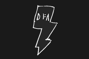
Sure, we could make everything slick, perfect, amazing – but that’s not interesting.
“I don’t like pretty. I like secret gems,” James Murphy told The New Yorker in 2010. “You wanna feel like beauty is a rare thing.” Disco-punk label DFA remains one of New York’s jewels – even if it is, increasingly, not a secret. Celebrating its 12th anniversary this year, the label (founded by Murphy, Tim Goldsworthy and Jonathan Galkin) arrived on the scene at the precise moment in 2001 when New York needed a musical boost.
DFA’s musical style comprises a carefully wrought combination of ingredients: live drums, analog synthesizers and a fondness for cowbells. The design approach – dense with scribbles, rubber-stamping, and heavily photocopied text – is equally eclectic, skewing more punk than disco. “It’s not polished, so people don’t think of it as design,” says art director Michael Vadino, “but it’s all very contemplated.” He adds, “Some human element has to be injected, otherwise everything just looks like it came out of a machine.”
According to Vadino, he and Murphy share “a slight bit of OCD. Sure, we could make everything slick, perfect, amazing – but that’s not interesting.” Instead they intentionally added constraints, paring down their design tools to pencils, graph paper and Polaroids. “That’s when really interesting things happen. When you’re constrained you have to get creative.” He says the most common feedback he gets from Murphy is: “It’s looking good, but can you make it a little bit shittier?” There’s something funny about two self-described obsessives concerned with making things look like crap.
Until recently, DFA’s logo – a doodle of a lightning bolt – remained unattributed. As Vadino recalls, “At the studio one day – back in 2000 – somebody just scribbled this little lightning bolt on graph paper and at the top added [the letters] DFA. And I was like, ‘That kind of rules. That should be your logo.’ James and Tim just totally dismissed me. I was like, ‘I don’t care. I’m going to use it.’ So I just started putting it on flyers, and that became the de facto logo. It was only in 2010, after a retrospective of DFA’s graphic work in Sydney, that Murphy claimed authorship, telling Vadino: “I drew that fucking thing.” - Laura Forde
EPMD
The fine-art playing field was the only avenue for us as artists to start developing careers and trying to get paid for our work.
Erick Sermon and Parrish Smith met in high school on Long Island and started making music together in the mid-’80s under the name EPMD: Erick and Parrish Making Dollars. Both were equal parts MC and producer, and they stated their ambitions plainly. Working the word “business” into every album title, EPMD took a calculated approach to getting signed; the song “Please Listen to My Demo” even details the doors that closed on them before landing their first deal with Fresh, a hip hop imprint of Sleeping Bag Records. In 1987 they put out their first single, “It’s My Thing,” which opens with the helicopters from Pink Floyd’s “The Wall” before looping in the funk of The Whole Darn Family and a vocal from Marva Whitney. Street smart yet playful, with a laid-back energy that inspired the next decade’s West Coast gangsta rap, EPMD had the drive and skills to make it big.
Uptown graffiti writer Eric Haze was just as driven. As a member of Marc “Ali” Edmonds’ Soul Artists crew, Haze got to know The Beastie Boys, started doing work with them, and soon made a name for himself. Since the downtown gallery scene was already enamored with street art, “the fine-art playing field was the only avenue for us as artists to start developing careers and trying to get paid for our work,” Haze says. Realizing he preferred the written word and letterforms to painting, Haze went to the School of Visual Arts in 1982 and set out, he says, “to become the premier logo designer of my generation.” In 1987 he designed covers for Public Enemy’s Yo Bum Rush the Show and LL Cool J’s Bigger and Deffer, where he famously riffed on the Kool cigarette logo’s overlapping O’s. Those groups were repped by Russell Simmons and Lyor Cohen’s hip-hop juggernaut Rush Artist Management, which included EPMD.
Haze got hired by Fresh to create the logo for the group’s 1988 debut, Strictly Business, without having met the duo or heard their music. “At that point, Run-DMC was the sole existing iconic logo in hip-hop, so I took my cues from the strength of the bars in that logo,” he says. With that bold, custom-lettered mark, Haze proved he was no amateur, and made EPMD look like the contenders they were. - Sue Apfelbaum
Fania
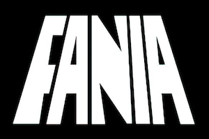
Sanabria’s hand-drawn logotype wasn’t so much precise as it was full of character.
Fania art director Izzy Sanabria is better known for his exuberant album covers and his larger-than-life stage presence as the Fania All-Stars’ MC than he is for designing its logo. For someone dedicated to “improving the image of Latin artists” while bringing salsa music to the world, a logo seems minor; yet for nearly 50 years the Fania mark has held tremendous weight as a symbol of great Latin music.
The label was started in 1964 by bandleader Johnny Pacheco and his lawyer Jerry Masucci. They enlisted Sanabria, who’d previously designed the cover of Pacheco’s smash 1960 album, Pacheco y Su Charanga, on Alegre Records. “That became the biggest-selling Latin album at the time,” says Sanabria, whose woodcut rendering of a flutist on that cover became iconic as well. For his first Fania commission, Pacheco at the NY World’s Fair, Sanabria revived that woodcut style, only this time with an image of a percussionist and bold lettering that he razor-cut from black paper.
If the beveled-type Fania logo in the upper right corner looks generic, that’s because it was. “The first one was done at the printers,” says Sanabria. “[Around 1968] Jerry wanted a new logo, so we went through some typefaces until we found something that he liked, and from that I deviated,” he says. With its angled block letters leaning inward (to form the shape of a mesa) and a bubbly dot over the “I,” Sanabria’s hand-drawn logotype wasn’t so much precise as it was full of character. That design endured for 26 years, branding such infamous Sanabria covers as Ray Barretto’s Power (inspired by the story of Samson’s hair) and Willie Colón’s The Big Break (spoofing an FBI’s Most Wanted flyer).
Today’s logo is from a pastel artwork by fashion illustrator Joe Eula for the Fania All-Stars’ 30th anniversary album cover, with the letters F-A-N-I-A stretched tall, rising up high behind the musicians. “Eventually we decided to use that as the basis for a logo,” says Sanabria, who standardized the colors and redrew the letters with straighter lines. The spirit of the previous logo is there in Eula’s rendition, which Sanabria describes as “like a piece of fine art.” - Sue Apfelbaum
Fool’s Gold
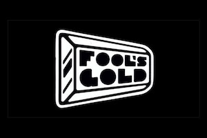
A lot of dance music, it’s very, very self-serious. This is supposed to be fun.
Sometimes it seems like the streets of New York are paved with gold – Fool’s Gold, that is. A slight exaggeration, but you don’t have to go far to find the hybrid dance-music and hip hop label’s stickers underneath your feet, slapped onto sidewalks and curbs as well as most any other available surface. Shaped like a gold brick and spelled out in bulbous, hand-drawn geometric letters with the counters filled in, the Fool’s Gold logo and the name it bears reflect the Williamsburg brand’s tongue-in-cheek take on hip hop posturing.
“We wanted something that could have the swagger of hip hop but not be so on the nose – something that didn’t take itself too seriously,” says Nick Catchdubs, who co-founded the label with fellow DJ/producer A-Trak in 2007. The approach from the start was “let’s have an artist-run label for the sorts of oddball records we were playing in our DJ sets,” he says.
In the beginning there was also an eclectic “minister of art” sharing the helm: Joshua Prince, AKA Dust La Rock, the man behind that sticky image and all of the label’s artistic output for its first few years. For a generation reared on the Nickelodeon channel, Prince’s cartoony logotype is especially merry and familiar. Writing from his current base in LA, Prince says his process involves doing extensive research into any and all elements related to the content. In this case, what he turned up was “gold, in all its many forms” and “late ’80s and early ’90s house and hip hop record-sleeve and label graphics.” He cites design influences ranging from the Designers Republic’s work for Pop Will Eat Itself and the Warp label to Genesis P-Orridge’s Psychick Cross and the occult.
The solid-gold identity lends itself well to merchandise, of which they sell plenty, and to the label’s own Mr. Goldbar mascot, who could give Mr. Peanut a run for his money. “A lot of dance music, it’s very, very self-serious,” says Catchdubs. “This is supposed to be fun.” - Sue Apfelbaum
Giant Step
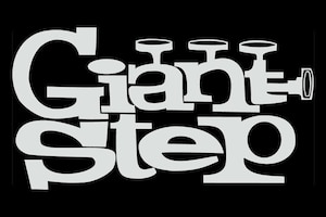
It basically said everything about who we were.
A month after graduating from Rhode Island School of Design in 1992, Kevin Lyons knocked on the door of the Groove Academy offices. “I had seen an ad in Paper and mistakenly assumed it was a record store,” he says. There he met Maurice Bernstein and Jonathan Rudnick, founders of a marketing and concert-promotions company “dedicated to the preservation of funk” and creators of the New York club night Giant Step. After glancing at Lyons’ sketchbook, they gave him a crack at designing the party’s logo.
Giant Step, founded in 1990, may have imported its retro vibe – a fusion of bebop, beatnik and funk – from London’s acid-jazz scene, but its hip hop energy was pure New York. “The name came from two places,” recalls Bernstein. “For those that knew, there was the Coltrane reference, but it was also a statement of intent: we wanted to take a musical leap from what was going on in the city at that time.” In 1990 that meant a five-dollar cover and a young, mixed crowd getting its groove on to seamless DJ sets of house, funk and jazz-infused hip hop. There were also live musicians in the mix: a flutist, horn players, percussionists, rappers and singers, in an evolving house band who came to be known as Groove Collective.
Rather than create another homage to Reid Miles’ Blue Note album cover designs, Lyons recalls being inspired by the playful hand-lettered style of the title sequence from the 1960s TV series My Three Sons. “I thought, ‘What if the word giant was a trumpet, with the wood-type-style letters kind of bouncing up and down?” He stayed up all night working on it. “I drew it a million times and edited the letters with Wite-Out.” The core of the drawing is still being used today. “He nailed it,” recalls Bernstein. “It basically said everything about who we were.” - Laura Forde
KISS
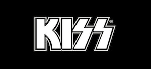
Nothing really lined up. The two S’s were at different angles and kind of leaning. It just bugged me.
The face paint and high-heeled boots have come and gone, but KISS’s logo is forever. Few insignia are as potent as that bold-lettered K-I-double-lightning-bolts. As striking as everything else about the NYC rockers, it’s barely been altered since the mid-’70s – with the exception of a neutered version used in Germany since 1980, in response to accusations that the band was glorifying the Nazi SS insignia (both of which use runic-style lettering).
By all accounts, lead guitarist Ace Frehley had a knack for art and designed it. According to one story, Frehley wrote the name over a poster for Wicked Lester – the band Gene Simmons and Paul Stanley left to form KISS – and came up with those S’s on the fly. What doesn’t get mentioned is that some of Wicked Lester’s artwork used a jagged lightning bolt in place of its own single S. What’s also unknown is Paul Stanley’s role in making the logo.
Hand-letterer Michael Doret, who created the elaborate artwork for the band’s 1976 Rock and Roll Over and 2009 Sonic Boom LPs, recalls that while he was working on the latter, “Paul was over here at my studio and I asked him about that logo. And he said to me that he drew that on his kitchen table very early on, with a T-square and a triangle and some technical pens.” In a 2004 Billboard interview, Simmons stated that Frehley designed it but Stanley drew it, creating the original logo that would be used on every cover. Not Doret’s, though. “I never really liked the way it fit together,” says Doret, whose iconic work includes the New York Knicks logo. “On both the album covers that I did, I redrew it,” he admits, noting that Stanley told him, “‘You’re the only one I’ve ever allowed to redraw this logo.’”
So, what needed fixing? “I look for geometry in things, and just nothing really lined up. The two S’s were at different angles and kind of leaning. It just bugged me,” says Doret. “The first time around, [on] Rock and Roll Over, I never even told them. But I think Paul knew.” - Sue Apfelbaum
Masters at Work

When we decided to start our own label... we put the heads together.
“You guys are the first people in 23 years who ever asked who did the logo,” says Kenny ‘Dope’ Gonzalez, one of the founding DJ/producers behind the house music duo Masters At Work. The concept seems simple: the two iconized heads represent the hip hop loving Gonzalez, with a sideways baseball cap, and salsa-influenced partner ‘Little’ Louie Vega, with the fedora and goatee, in a style lifted from the ubiquitous “Men at Work” hard-hat construction signs. But in fact, the story isn’t as clear-cut.
Before Gonzalez (who is from Sunset Park, Brooklyn) met Vega (from the Bronx) through fellow house DJ Todd Terry in the mid-’80s, he was making beats, throwing parties with fellow DJ Mike Delgado, and working at local record store WNR Music Center. One of the store’s regulars was Luis Negron, aka KAB-ONE, a graffiti writer who was part of a crew with Revlon (AKA REVS, the one with the long-standing, highly visible beef with COST), though he kept a lower profile. Negron started making flyers for Gonzalez and Delgado’s Masters At Work parties and designed the block-lettered logo for the Nu Groove label and Gonzalez’s Dopewax imprint.
Negron rendered the first Masters At Work logo in 1989 in the form of a reel-to-reel deck, which Gonzalez says was limited to use on local flyers (until a few years ago, when he had it printed it on a t-shirt). By the time Vega and Gonzalez officially teamed up as Masters At Work and released their first album on Cutting Records in 1993, their signature image was a graphic explosion of an unspooling tape reel, floating keyboards and a flying record, with those now-iconic hat-wearing heads on either side. Later the image was streamlined to what it is now. “When we decided to start our own label and make it a production company, that’s when we put the heads together. Then it was MAW Records,” Gonzalez says.
In addition to being the go-to guy for graphics, Negron has served in the US Navy since their Sunset Park days. Currently stationed in Afghanistan, he was unavailable for comment. But as far as MAW is concerned, all credit to KAB-ONE is due. - Sue Apfelbaum
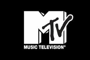
MTV
Most logos are designed by print designers and then motion designers have to figure out how to move them. That strikes me as kind of stupid.
MTV, the first 24-hour music-video network, launched on August 1, 1981, revolutionizing both music and television. The brand image that emerged with this brave new visual world was as radical as what it represented. Well before Google Doodles and GIFs, founding MTV creative director Fred Seibert flouted “good” logo-design standards when he lobbied for Manhattan Design’s block-lettered M and spray-painted T-V – and its concept of mutability – helping establish the channel’s personality as young, rebellious and unpredictable.
Despite pressure to work with big-name designers, Seibert favored the unknown firm – it was cofounded by his childhood friend Frank Olinsky. Seibert and Olinsky grew up together in Huntington, Long Island, and Seibert credits Olinsky with turning him onto music and the revelation that cartoons are made by people. “My father was an animator and commercial artist, and he taught me how to use the tools of the trade,” says Olinsky.
Manhattan Design had a tiny shop in the back of a t’ai chi studio above Bigelow Pharmacy in Greenwich Village; it was there, after more than eight months of work – and long before the MTV name had even been decided upon – that Olinsky posted a prototype of that logo on the wall. He cites being inspired by punk, graffiti and an animated children’s show from his youth, Winky Dink and You, which invited home audiences to complete scenes by drawing on clear plastic sheets draped over the front of their TV sets. The epiphany to make something that vandalized the establishment and could be morphed in countless ways turned out to be right for the time and the medium. “Most logos are designed by print designers and then motion designers have to figure out how to move them,” says Seibert. “That strikes me as kind of stupid.”
The corporate types at the channel hated everything about it, says Seibert, but accepted it with the words “Music Television” added beneath it in Helvetica – ironically, that part got hacked when the network redesigned the logo in 2010. That it endured almost 30 years is a testament to its early premise. As Olinsky observes, “The idea was that nobody really owns this, which is, in a traditional sense, very anti-logo thinking.” - Sue Apfelbaum
Nervous Records
The Arsenio Hall flat-top hairstyle was in vogue and I thought of the idea of having a speeding record buzz the top off of the character’s afro.
Nervous Records founder Michael Weiss grew up with the music business in his blood – his father was a record distributor who also ran a disco label called Sam Records. That Weiss might end up starting his own label around his generation’s dance music – hip hop and house, by artists such as Black Moon, Todd Terry, Armand van Helden and Masters At Work – was an easy bet, certainly nothing to be nervous about. So why the name? “Before I launched Nervous Records I was promoting hip hop tracks for a different label, and I was a bit hyperactive in my approach. I used to bring records to a well-known hip hop DJ named Chuck Chillout on WBLS. I would go up there at 11:30 PM on Friday nights and was very insistent that Chuck play my songs before the show ended at midnight. He would call me Captain Nervous ’cause I was always so nervous that the show would end before he had a chance to play my song.”
The logo Weiss commissioned for his label in 1991 also captured the frenetic energy of DJs who were eager to get hold of the newest and hottest limited-edition vinyl. “The idea was to create a parody of a super-hero character in the DJ world,” says Weiss. “This was before DJs were considered the massive stars they are now. But in my world, the independent NYC dance label scene, DJs and producers were our stars.”
Weiss knew an art director at EMI/Chrysalis named Marc Cozza who had done some covers for Sam Records, whom he asked to design a logo. “My first and only idea was to create an iconic character that could live on its own, without even using the word ‘nervous,’” says Cozza. “I was channeling George Herriman’s Krazy Kat and also the Superwest comic books. At the time, the Arsenio Hall flat-top hairstyle was in vogue and I thought of the idea of having a speeding record buzz the top off of the character’s afro, leaving him shaking but with a perfect haircut.”
The first logo was circular, since it was designed with vinyl in mind, and used a simple sans-serif font. In 2004, Weiss had it updated to better suit the digital marketplace, making it square and setting the figure against a brick wall, with graffiti writing by Blake “KEO” Lethem “to embellish the urban aspect.” - Sue Apfelbaum
New York Hardcore
In a way, the NYHC logo was a declaration of our scene, a statement.
New York hardcore, the sped-up, ideological hybrid of punk and metal that emerged in the early ’80s, has many factions and one overarching symbol of solidarity: the letter X with the initials N-Y and H-C written through it. That tribal mark not only brands the local scene but has also spawned countless copycats in cities and suburbs around the world.
Club bouncers would write an X on the hands of underage kids at shows. By some accounts, Ian MacKaye and Jeff Nelson of D.C.’s The Teen Idles (and later Minor Threat) had gotten their hands X’d at a West Coast club and Nelson, a designer, brought the image into their artwork. Over time, as they asserted a drug-free message as inspired by hardcore heroes Bad Brains, the symbol morphed to signify straight edge. As Glen Cummings, former guitarist for NYHC band Ludichrist and a designer who has studied the X in depth, explains, “It changed from ‘I can’t drink’ to ‘I won’t drink’ [and as the scene grew more violent] to ‘I’ll beat you up if you do.’”
While Cro-Mags, Agnostic Front and Murphy’s Law came to define New York hardcore, it was the lesser-known straight-edge band The Abused’s lead singer Kevin Crowley who put the NYHC X on the map. He started using it as part of his painstakingly drawn flyers for the band’s shows at clubs like CBGB and A7 in Alphabet City. As Crowley recently told the Noise Creep blog, “I wanted to make people remember us [and] I wanted our music and the artwork associated with the band to be cohesive. The hardcore scene was pretty territorial. New York, Boston, D.C. – it was almost the way people are with sports teams. I was a huge fan of the music coming out of those other cities, but NYC was my hometown! In a way, the NYHC logo was a declaration of our scene, a statement.”
In addition to being a badge of hometown pride, the symbol was an easy way for unknown bands to communicate, “Hey, we’re part of this genre” on their flyers, says Cummings. Steven Blush, author and filmmaker of American Hardcore, also credits The Abused with “taking the X to the next level,” noting that “the four letters of NYHC brought to the X a perfect symmetry.” Crowley says, “The truth is, I never imagined it would catch on like it did.” - Sue Apfelbaum
Paradise Garage
Five years into the club there was a second logo made, with a dancer in the forefront and in back of him was a rainbow pyramid. There was an uprising against it.
The muscular man with the tattooed bicep, downward glance and raised-up tambourine symbolizes a particular time and place that lasted only a decade, yet it remains permanently fixed in dance music legend and gay culture. Housed inside a parking facility at King and Varick Streets from 1976 to 1987, Paradise Garage was the perfect name for the concrete space that became a haven for music lovers, and especially for gay men who could feel safe as their true selves. On Fridays and Saturdays, DJ Larry Levan threw epic parties that centered around acceptance and community, in contrast to the more decadent focus of competing clubs. “In New York there were two logos that stood out: Studio 54’s giant 54 and Paradise Garage’s garage man,” says former Garage DJ David DePino.
Nearly everyone who attended describes the Paradise Garage in sacred terms. “It was church,” says DePino. “People went to dance, to worship the music, to release all their frustrations of the week.” DePino helped Levan and Michael Brody find the space and held many roles, including being one of the few besides Levan to spin records there. He’s also one of the last survivors – Brody died of complications from AIDS in 1987, Levan from drug-related heart failure in 1992.
DePino doesn’t know who first drew the logo, but he clearly remembers its model: Willie Gonzales, head of security during the Garage’s first couple of years and a professional body builder. The tambourine wasn’t part of his persona, but the curly hair and ripped muscles were. The logo is perhaps best remembered in neon, in the form of an illuminated sign at the top of the ramp that led to the club’s entrance. Merchandising helped seal its destiny, too. DePino recalls how people started drawing the logo on their own t-shirts – and some dancers would go through several on any given night: “People would come to the Garage in their regular clothes and they would change to dance. And you would sweat – there was no air conditioning there. That’s when Michael started saying, ‘I should sell t-shirts and people will buy them.’ The second he did, they sold out in one night.” DePino also remembers what happened when Brody tried to break with tradition. “Five years into the club there was a second logo made, with a dancer in the forefront and in back of him was a rainbow pyramid. There was an uprising against it.” - Sue Apfelbaum
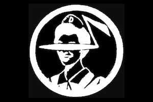
Public Enemy
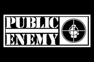
The model for the godfather hat-wearing figure has been mistaken for a state trooper, but it was in fact E-Love, LL Cool J’s producer and sidekick.
The world at large first witnessed Public Enemy when The Beastie Boys took them on their 1987 Licensed to Ill tour, introducing thousands of suburban kids to the activist flip side of the Beasties’ rambunctious party rap. While the headliner’s stage act included writhing girls in cages, Public Enemy’s Chuck D, Flavor Flav and DJ Terminator X came off dead serious, flanked by footmen in military garb and backed by a banner bearing the image of a silhouetted figure locked in the sights of a rifle’s crosshairs. PE’s entire presentation served as a wake-up call.
That disquieting graphic identity, paired with an Army-inspired stencil logotype, was designed by PE mastermind Chuck D. Born Carlton Douglas Ridenhour in Queens, he had earned his bachelor’s in graphic design from Adelphi College in 1984 with the goal of working in the art department of a record company. He did not see himself becoming a successful recording artist – Rick Rubin hounded him relentlessly until he signed with Def Jam – let alone an inductee into the Rock and Roll Hall of Fame.
As Chuck D told the Red Bull Music Academy in Barcelona in 2008, “I always liked to see the rock ’n’ roll guys; they had logos, so why couldn’t it be the same in rap? I wanted to make the music legitimate, as much as other genres.” Chuck came up with the concept, cutting and pasting a mock-up by hand. The model for the godfather hat-wearing figure has been mistaken for a state trooper, but it was in fact E-Love, LL Cool J’s producer and sidekick. “I cut E-Love’s picture from a magazine, blackened it in, pasted on crosshairs and put it through a copying machine,” Chuck explains via email. That rough image was then refined and rendered for use by “clean-up man” Eric Haze, who art directed the cover of their debut album, Yo! Bum Rush the Show. “When the time came to create his artwork, [Chuck] knew exactly what he wanted,” recalls Def Jam art director Cey Adams. “His idea was that the black man is a target in America.” - Sue Apfelbaum
Ramones
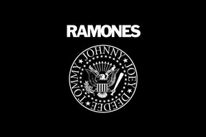
The punk scene was trying to distance itself from the hippie scene. What better way to do so than embrace patriotism?
For original punk rockers Johnny, Joey, Dee Dee and Tommy Ramone, less was more. Their economy of dress – tight tees, biker jackets, ripped jeans and canvas sneakers – matched the efficiency of their sound: fast, compressed, unadorned rock ’n’ roll. An odd bunch from Forest Hills, Queens, the Ramones banded together in 1974 as brothers in musical ambition (if not blood). But friend and artist Arturo Vega visually communicated a “more is more” approach in their logo, enlarging the Ramones name in a heavy, highly visible typeface and incorporating the Great Seal of the United States.
Vega designed many of the band’s graphics throughout the Ramones’ 22-year career. Born in Mexico, he was enamored with symbols of power, specifically the bald eagle in US heraldry. “I always thought of the Ramones as... an all-American band,” Vega told the Fringe Underground site. In a 2012 podcast interview with Going Off Track, he described modeling the eagle on the Ramones t-shirt design from the reverse side of an Eisenhower dollar. An early poster centers on Vega’s midsection and his eagle belt buckle, blown up from a photo-booth self-portrait.
Punk magazine cofounder and Ramones illustrator John Holmstrom recalls that image: “There was a vague feeling of S&M about it, and its simplicity to me defined the New York punk rock scene.” In 1976, the bicentennial year, Vega decided upon the eagle from the US seal, modified the iconography, and added the band members’ names (which would change with the lineup over time). The emblem first appeared on the back of the Ramones second album, Leave Home, released in January 1977.
“Using a national symbol was a perfect move back then, because the punk scene was trying to distance itself from the hippie scene,” says Holmstrom. “What better way to do so than embrace patriotism?” For the band name, Vega wanted to be simple and direct with an all-caps sans serif, eventually settling on Franklin Gothic, the same font that would appear on the Run-DMC logo a decade later. Most of the original Ramones have passed on, but Ramones t-shirts are as present as ever. The logo, Holmstrom says, “has become so iconic, not just for the band but for all of punk rock.” - Sue Apfelbaum
Run-DMC
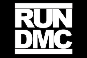
Franklin Gothic was “tough” and forthright without being old-fashioned or faddish. [It’s a] good, solid, no-nonsense font.
Run-DMC was one of the first rap acts to break into the mainstream. In addition to their clockwork rhymes, earworm hooks and guitar riffs that fed their cross-genre appeal, it didn’t hurt that the Hollis, Queens, trio looked sharp in unscuffed, unlaced shell-toe Adidas, fedoras and Kangol hats, and thick gold chains. Keeping with their tougher-than-leather image was a killer logo that looked invincible writ large on t-shirts and merch. Stacked between two thick red lines and set in Franklin Gothic Heavy, the all-caps RUN and DMC form one of the most imitated logos of all time.
Finding out who designed it... that’s tricky. Graffiti artist turned designer Cey Adams, who did the hand-lettering on Run-DMC’s self-titled debut, is often given credit by mistake. When asked, Adams responded, “To this day, nobody really knows for sure exactly who did it. But it was done by a designer in England that did the King of Rock album and the ‘You Talk Too Much’ single [in 1985].” Now the truth is out: Ashley Newton, then the head of A&R at Island Records and now the CEO of Columbia, commissioned the logo from the label’s in-house team, specifically one Stephanie Nash.
Nash, now co-principal of Michael Nash Associates, a London design studio, did not expect any individual credit. “I remember listening [to the music] and thinking how visually typographic it was,” she says via email. “Rap was very inspirational for me at that time: large, meaningful, hard-hitting words used with such power that I had not heard before.” Her choice of the typeface came about simply: “At the time we had a limited number of fonts available, and Franklin Gothic was ‘tough’ and forthright without being old-fashioned or faddish. [It’s a] good, solid, no-nonsense font. Run-DMC’s name helped in having two sets of three letters.” The fact that it’s lasted so long she attributes to MF Benton, the typeface’s designer, and the strength of Run-DMC itself. “If the same graphic had been done for a pop band, it would not have acquired the same kudos.” - Sue Apfelbaum
Studio 54
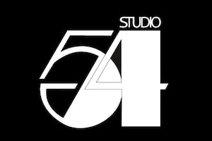
The logo borrows its chunky thicks and hairline thins from the art deco letterforms that were so fashionable in the ’70s.
The French may claim to have invented the discothèque 30 years earlier, but on April 26, 1977, two Brooklyn natives elevated the concept to mythical status. Studio 54, located in a refurbished 1927 opera house on West 54th Street, was the creation of Ian Schrager and the late Steve Rubell. It was a place where, according to British socialite and writer Anthony Haden-Guest, people “shed the dull gravitational tug of quotidienne life, and lost themselves in a voyeuristic jostle.”
A year earlier, Parisian “Queen of the Night” Régine Zylberberg had upped the disco design ante, spending half a million dollars outfitting her New York outpost of Regine’s with a hexagonal lighted dancefloor and a sculptural mirrored ceiling. The result was an art deco extravaganza that New York magazine deemed “the ultimate narcissistic trip.”
Not for long. Rubell and Schrager hired Broadway’s best interior and lighting designers to oversee Studio 54’s renovation, the centerpiece of which was a 5,400 square-foot dancefloor surrounded by ten silver banquettes, awash in an array of over 400 lighting effects – a never-ending spectacle. But the club’s most notorious design curiosity was surely the Man in the Moon, a suspended, cut-out cartoon of a half-moon face, paired with a moving cut-out coke spoon that discharged “a fizz of light” as the two made contact.
The club’s graphic identity, designed by Gilbert Lesser (1935-1990), was appropriately slick, perfectly fusing the decadence of the deco revival with strict Bauhaus geometry. Lesser, a designer best known for his distinctive theater posters for Equus (1974) and The Elephant Man (1979), custom created the elegant, tightly constructed 54. The logo borrows its chunky thicks and hairline thins from the art deco letterforms that were so fashionable in the ’70s, but its rigorous geometry and strong diagonal axis were more ’60s, allowing it to be effectively tipped at an angle, as it appeared on the club’s earliest black VIP cards.
Rubell was so concerned with the club’s aura of exclusivity that the doorman kept crowds of people waiting outside even when the club was not full. As Village Voice gossip columnist Michael Musto said, “Studio 54 was not just the be-all and end-all, it was the be-there-or-end-it-all.” For a non-celebrity, getting beyond New York’s first velvet rope was its own reward. - Laura Forde
Tommy Boy
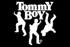
If you put them on the label and then spin around the record, maybe it’ll look like they’re spinning.
In 1981 Tom Silverman saw Afrika Bambaataa and recognized that the DJ’s mixing of Kraftwerk with funk was the future. Silverman, who ran a dance music industry newsletter at the time, was attuned to DJ culture and saw the beginnings of hip hop emerge in a post-disco world. When Bambaataa agreed to do a record with Silverman, Tommy Boy was born. The label’s first single was, per Bambaataa’s suggestion, “Havin’ Fun” by Cotton Candy, and featured a logo that Silverman had copied outright from a wooden crate of Tommy Boy grapes. Next came Afrika Bambaataa and the Jazzy Five’s “Jazzy Sensation,” which gave Tommy Boy the legitimacy to necessitate an official logo.
Monica Lynch, Tommy Boy’s first employee (and, later, a partner in the label) recalls, “It was a very small operation with no money. We didn’t have an art department. It was really kind of down and dirty.” She enlisted her friend and artist Steven Miglio to design a logo, which he did using Letraset and press type. Miglio bookended the words Tommy and Boy with uppercase letters, aligning them so that their stems dropped down below the baseline, and he added three dancing figures, all flipped around with curved arrows directing their movement. “It was based on the kids spinning on their heads, breakdancing on a piece of cardboard on the street,” says Miglio. The thought was, “if you put them on the label and then spin around the record, maybe it’ll look like they’re spinning.”
“The goal was to create a logo that had that visual energy and that clearly communicated b-boy culture,” says Lynch, and in that Miglio succeeded. The first release with the new logo was Afrika Bambaataa and Soulsonic Force’s “Planet Rock,” which became a massive hit, selling more than 600,000 copies and earning Tommy Boy major recognition. The logo would go on to be associated with artists like Queen Latifah, De La Soul and Digital Underground, as well as numerous beats compilations.
In 1989, Silverman hired logo designer Eric Haze to update the logo. Haze took out the arrows, changed the typeface and the relationship between the letters, and hand-drew and recomposed the figures. Silverman notes, “They originally had bellbottoms, and then when Eric redid it he changed the clothes they were wearing.” - Sue Apfelbaum
Wu-Tang Clan
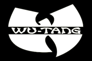
An early version showed a warrior’s severed head, held by his dreadlocks by a hand extending from the W, and had “Wu-Tang Clan” written through it in faux Asian-style handwriting.
The Wu-Tang Clan’s bat-winged W made its first appearance on the group's 1993 debut single “Protect Ya Neck,” as part of a more detailed hand-drawn illustration laden with the group’s spiritual and martial arts-inspired symbolism.
Mathematics, who designed the original logo, says, “The thing was to try and make something to stand out, kinda like the Batman insignia.” Although most of his work with Wu-Tang has been developing the group’s sound through a vast repository of samples, the former graffiti artist turned producer from Jamaica, Queens, studied graphic and commercial art at Thomas A. Edison Career and Technical Education High School.
Math had already been messing around with a few logo variations when it came down to an all-nighter as “Protect Ya Neck” was going to print. “At the time, I was doing carpentry work with my pops,” he recalls, “and RZA, Ghost, Power [Oliver Grant, Wu-Tang executive producer] and U-God, they came to the job at like ten o’clock in the morning and picked it up.” An early version showed a warrior’s severed head, held by his dreadlocks by a hand extending from the W, and had “Wu-Tang Clan” written through it in faux Asian-style handwriting. As RZA notes in the Wu-Tang Manual, “That one was too gory, but I liked how he wrote the letters, so I had him come up with the sword – because my tongue is my sword. But that didn’t reflect everything I was about either. So I told him it needs to represent the sword, the book and the wisdom.”
By the time their first album, Enter the Wu-Tang (36 Chambers), came out later that year, gone were the sword and book, but the mark of the W – in yellow, and still with Wu-Tang Clan written through it – remained. - Sue Apfelbaum
A version of this article appeared in The Daily Note, a free daily newspaper distributed in New York during the 2013 Red Bull Music Academy.